KPMG Wiise: Customer journey and conversion-focused marketing website
Designing a marketing website with user journeys and conversions as the key focus.

The website should speak to the many different customer segments that would benefit from the product. The purpose of the website is to communicate the benefits of the product to the target users and make it easy for them to sign up for a free or paid trial.
Client: KPMG, in collaboration with Microsoft and Commonwealth Bank of Australia.
Agency: Whitehat Agency
Project: Wiise
My role: Lead UX Designer
Project summary
KPMG was launching the new product Wiise, a cloud-based platform aimed predominantly at small businesses to manage their accounting, bank feeds, inventory, operations, and payroll — all under one platform.
This was a product launch in collaboration with Commonwealth Bank of Australia and Microsoft. KPMG wanted a marketing website for Wiise, with emphasis on conversion and user journeys that build confidence that this product is right for them. The website had to flow with unique user journeys, and keep in mind marketing messaging and extensive brand guidelines.
What I did
- Stakeholder management: running design presentations and feedback rounds for project leads and stakeholders from KPMG, Microsoft, and Commonwealth Bank.
- UX research: competitor research; synthesis of KPMG's own market and customer research to build optimal user journeys.
- Design: wireframing; information architecture; user flows; interactive wireframes and mockups using Invision; final visual designs and high fidelity mockups.
- Content: UX copywriting across all the designs; content guidelines for copywriting team; collaboration with copywriting team.
- Implementation: work closely with Whitehat Agency developers during implementation to review final deliverables for quality, and to ensure user experience is to the highest standard on the final build.
Designing for customer segmentations
KPMG had already conducted extensive market and customer research for Wiise. To truly understand the customer segmentations that the marketing website needed to cater for, my first step was to go through all this research in detail.
The research yieleded several key insights, as following.
Understand the needs of small businesses
The main target audience of Wiise is small-to-medium enterprises (SMEs). And KPMG's research showed that SMEs struggled with:
- Lack of time to accomplish admin tasks.
- Uncertainty on cash flow, inventory, and customers.
- Unorganised manual processes.
- Difficulty with accurate reporting due to disconnected systems.
Understand the competition
Several competitors came up during KPMG's research. These mainly consisted of entry-level accounting and payroll products that many SMEs used in conjunction with manual systems. While many of these products were helpful, some gaps were identified, such as:
- Entry-level accounting products struggle to handle complexity beyond a certain point.
- Entry-level products are often unable to scale with the business.
- SMEs were using several different disparate pieces of software that did not connect with each other.
- Traditional ERP products are aimed at large enterprises, hence out of the reach of SMEs.
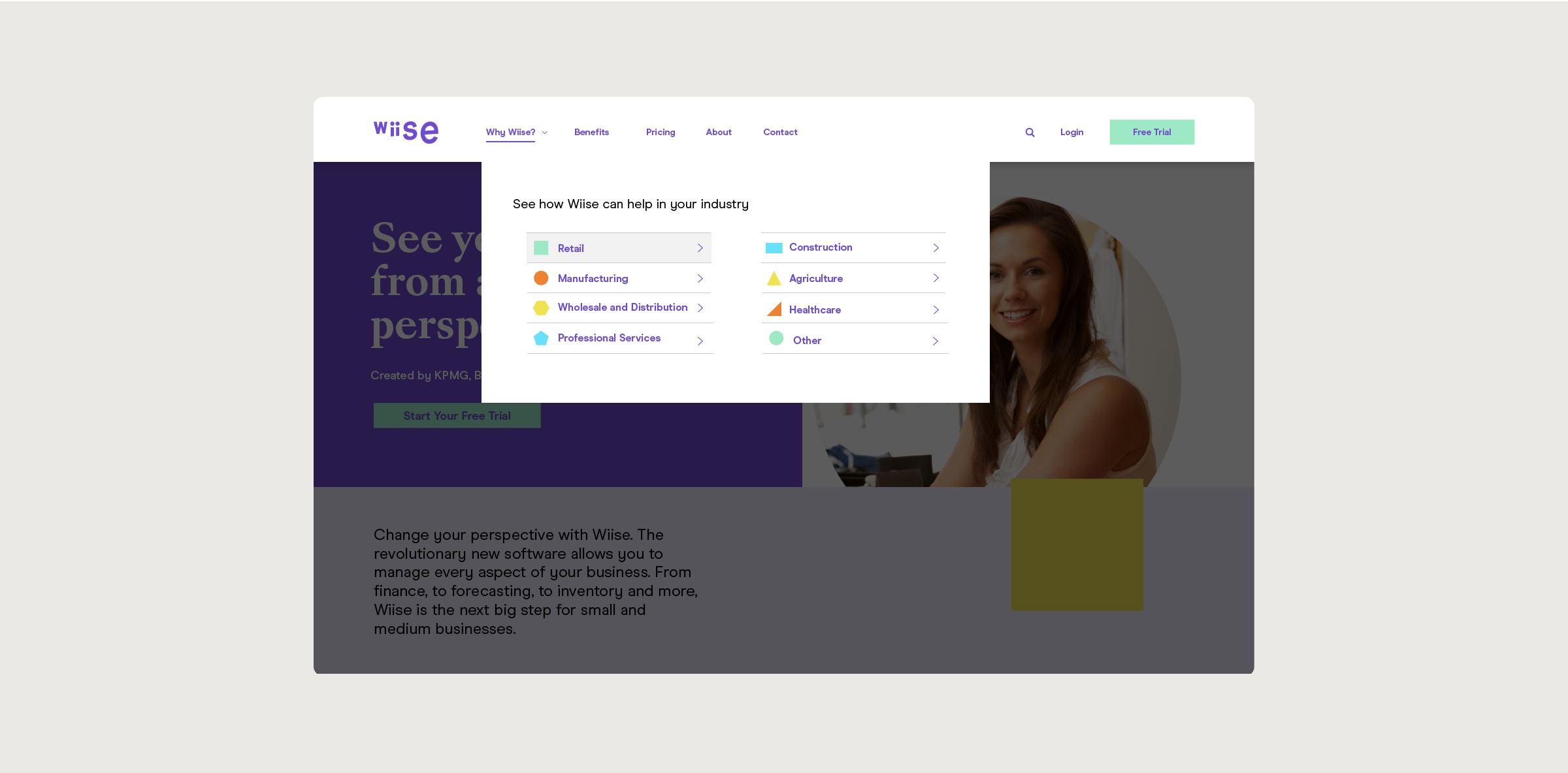
Industry matters
KPMG's research was summarised via user personas. What really stood out to me was how essential their industry sector was to SME owners.
SME owners wanted to understand the benefits of certain software products in the context of their industry. So, for example, if someone was the owner of a restaurant, and a software product's messaging did not mention hospitality sector, the owner would not find that product appealing, and assume it would not be helpful to them.
Designing the information architecture (IA) and user flows
With all the research insights added to my tool kit, I moved forwards with iterative designs of the information architecture and user flows.
There were a total of around 2-3 iterations. For each iteration, my process was the following:
- Sketch out the IA / user flow.
- Make wireframes illustrating the IA / user flow.
- Present wireframes to stakeholders via in-person presentations. The presentations took place weekly, and were open discussion with feedback welcome from all stakeholders.
- Send the Invision links of the interactive wireframes for any further written feedback, or for stakeholders who were unable to attend the presentations.
- Implement feedback on the IA / userflows by cycling through this process.
Information architecture (IA)
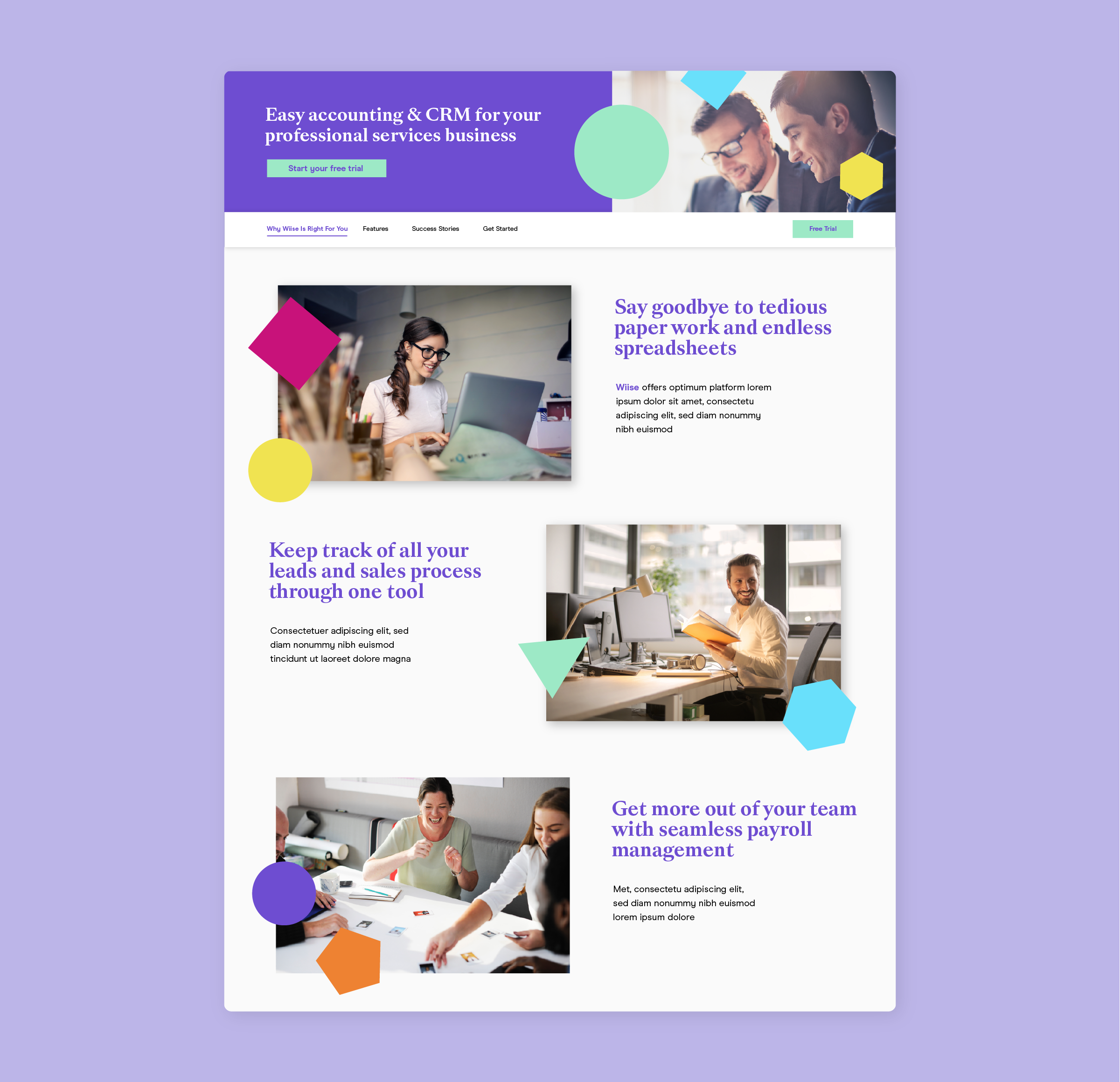
I designed the IA initially with a heavy focus on the industry verticals, in which each industry sector had a dedicated pillar page, full on content on Wiise's applicability to SMEs in that sector.
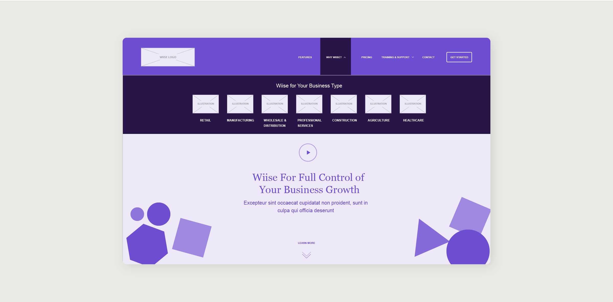
The aim of this IA was to:
- Make the expansion to other industry sectors easy once the need arises by keeping the website hierarchy flexible.
- Allow users view all the features of Wiise before they make the buying decision by adding in "Features" pages.
- Displaying content on each page so that each user sees information that is relevant to them, and makes it logical and easy for them to take the next step of signing up for a trial or paying for the software.
Through iterations, the IA remained consistent. The industry sectors were finalised, and "Features" was changed to "Benefits" based on client feedback (the former sounded too tech-focused).
The main call-to-action button was also changed from a vague "Get Started" to a much more enticing "Free Trial".
User flows
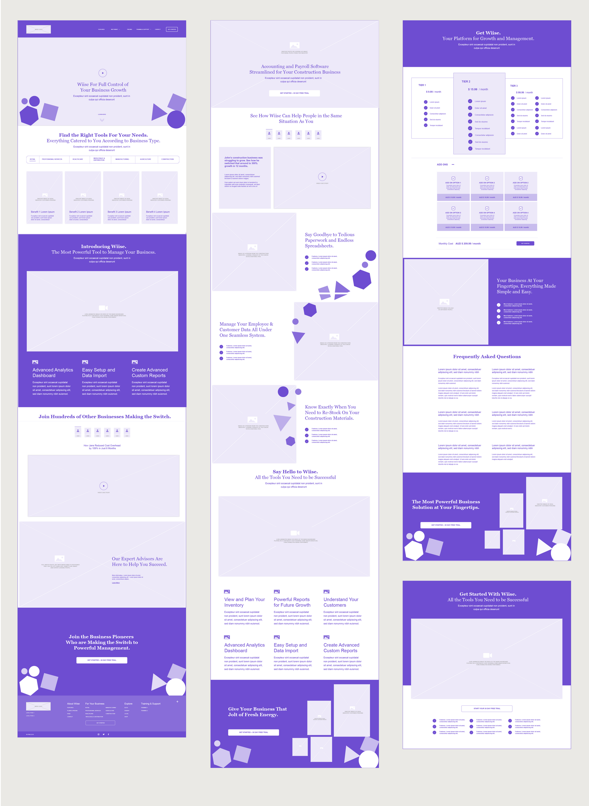
My first user flow was focused a lot on long, information-dense pages, which slowly guided the users towards a purchase decision.
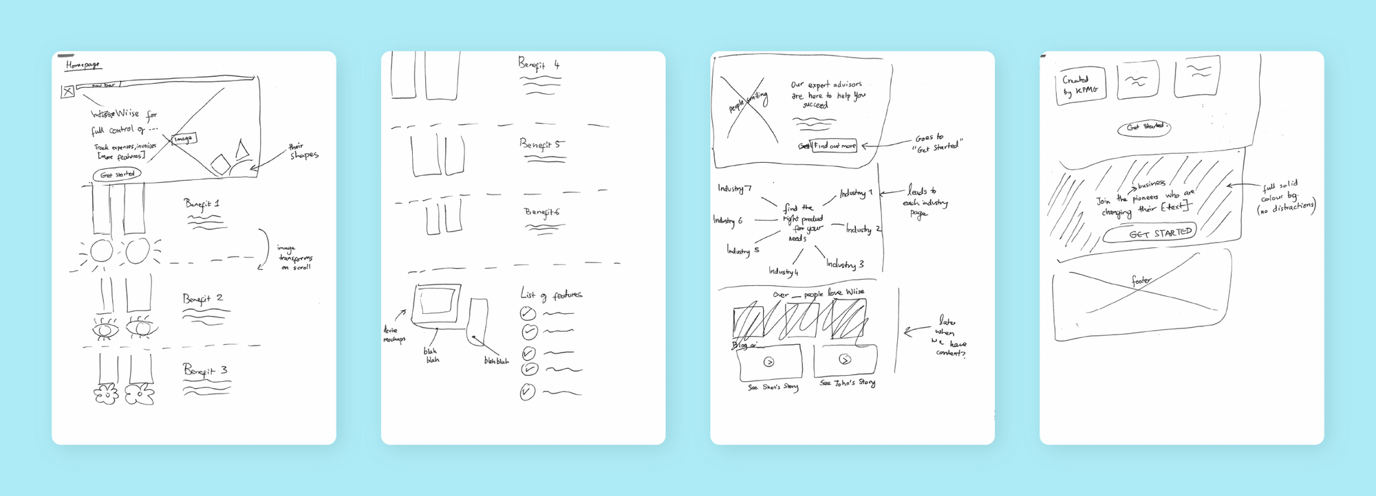
Each page had a conversion-focused user journey. I aimed to provide a user all the information they would possibly need so that they would convert at the end of the page.
The on-page user journey also had lots of trust-building elements, such as case studies, customer quotes, features, etc. This is important to have for a completely new product on the market.
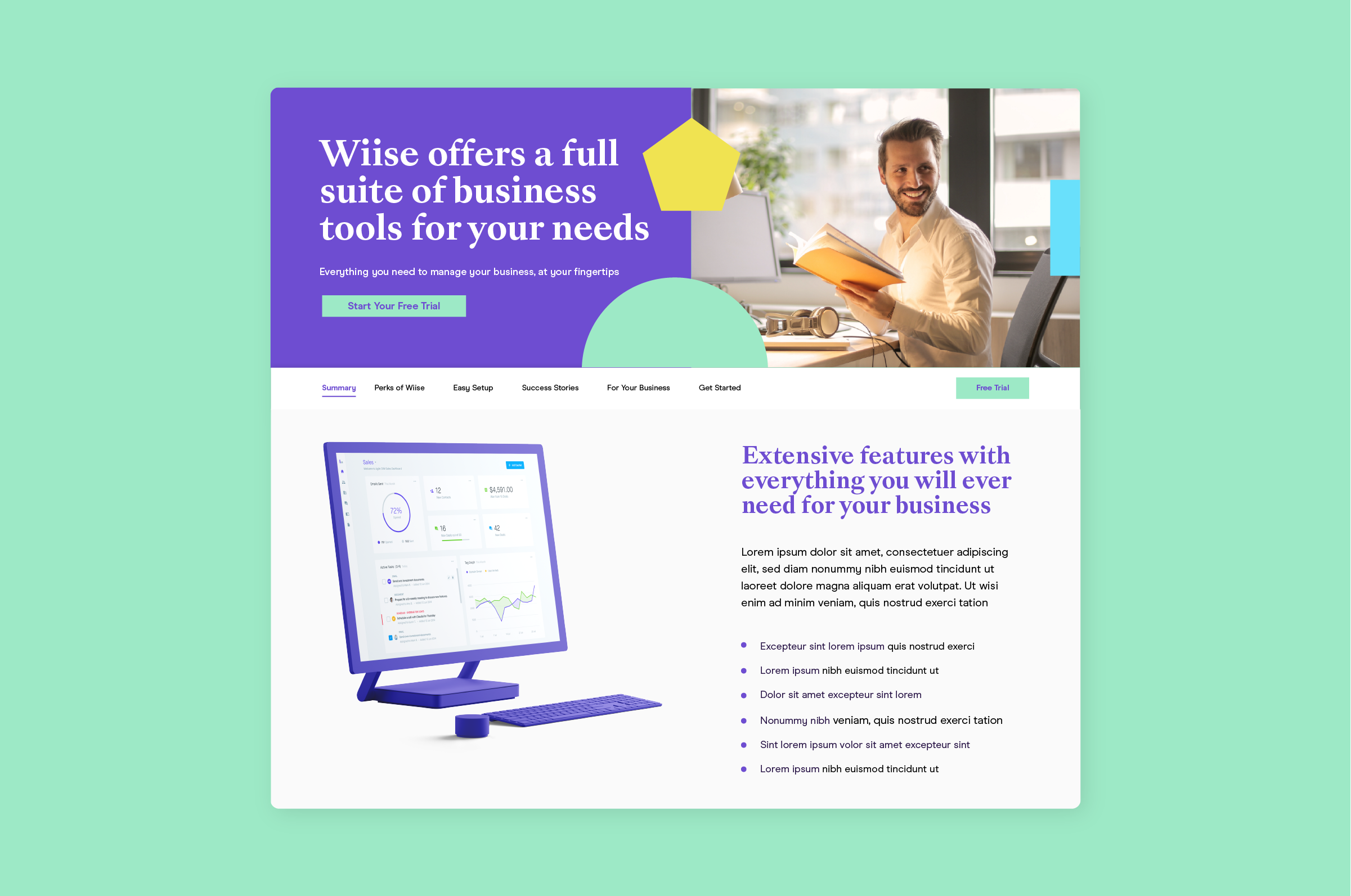
Because some of the pages were so long, I included a subnavigation on these pages. Subnavigations allow for users to easily traverse a long page, as well as give users the ability to quickly scan what content is placed on a page.
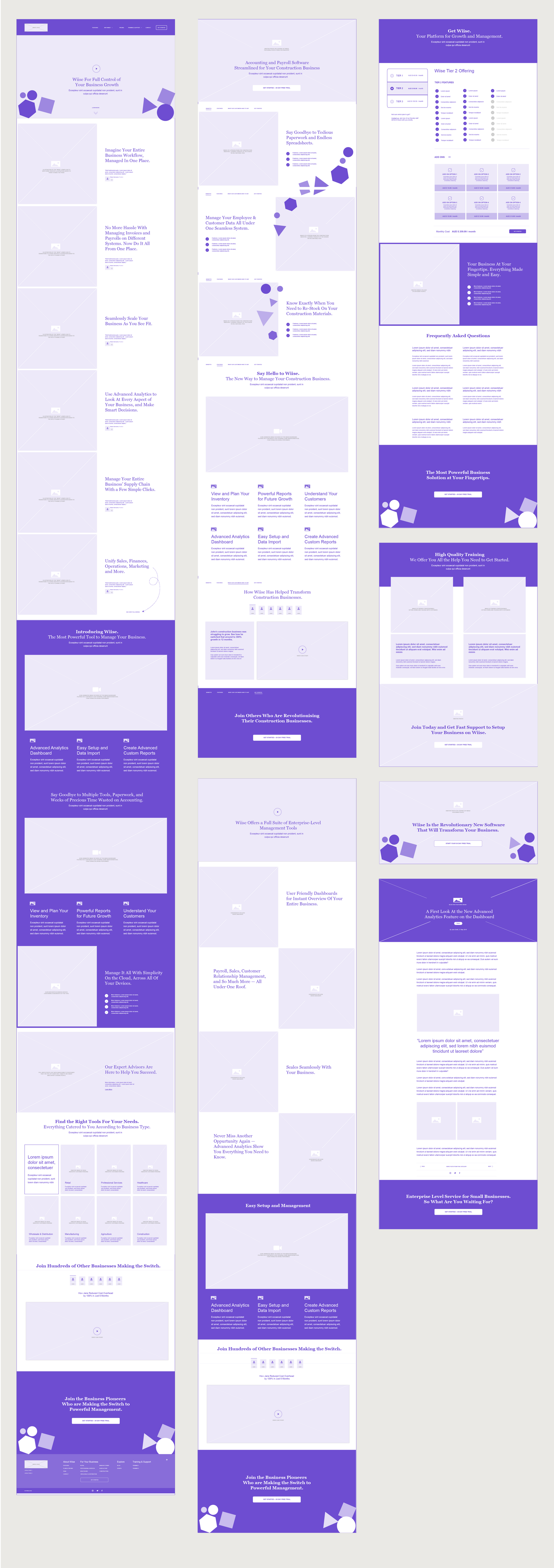
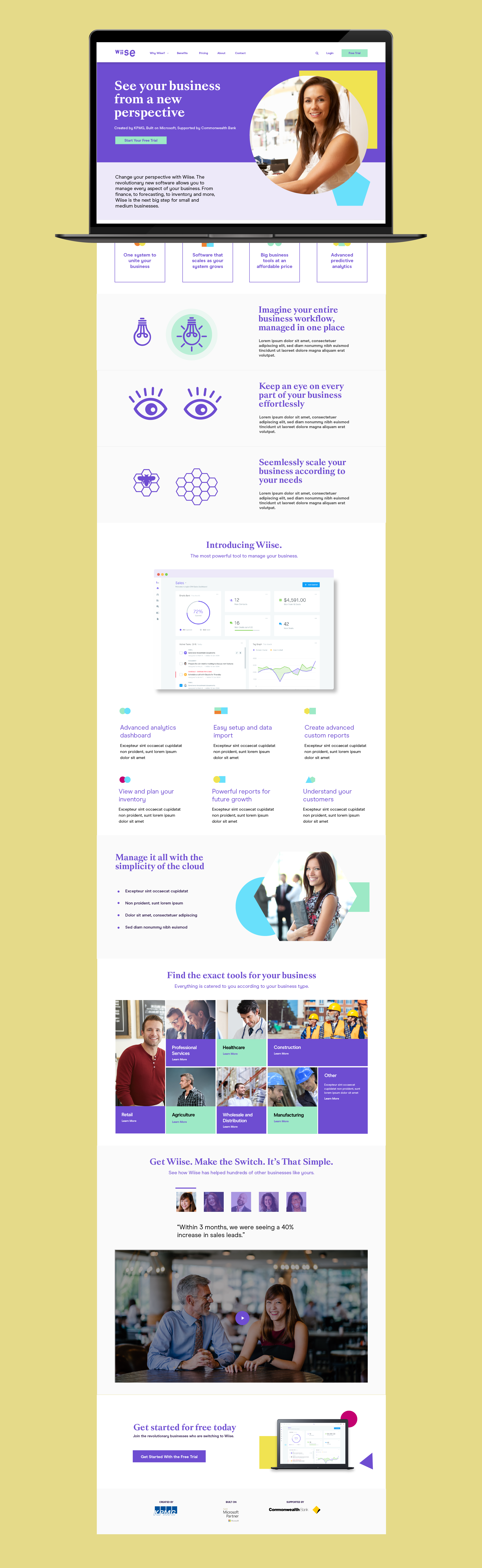
Initial feedback was that the pages were a bit too long, and information density should be increased. This was most important for the home page, as the first version seemed to go on forever.
After a few rounds of revisions I designed the very long pages to be more compact.
Visual design and UX copy aligned with brand values
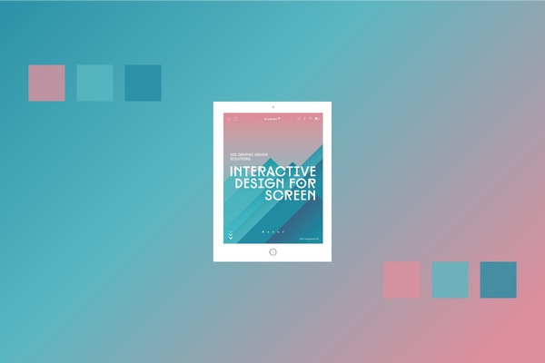
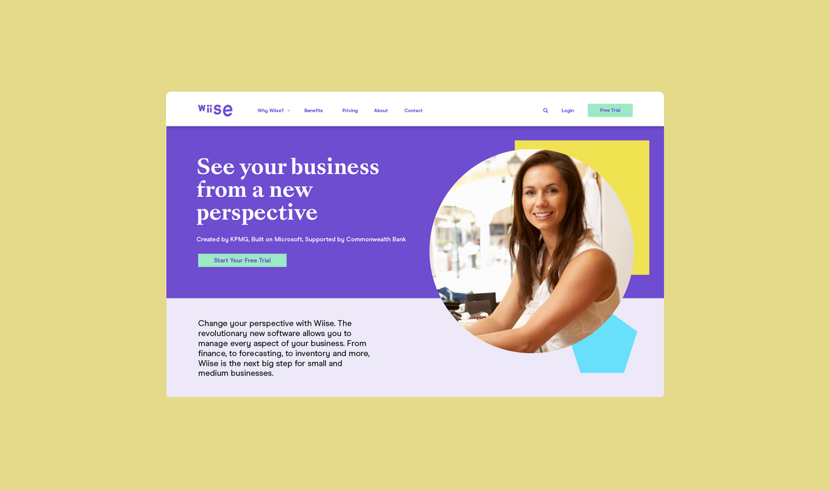
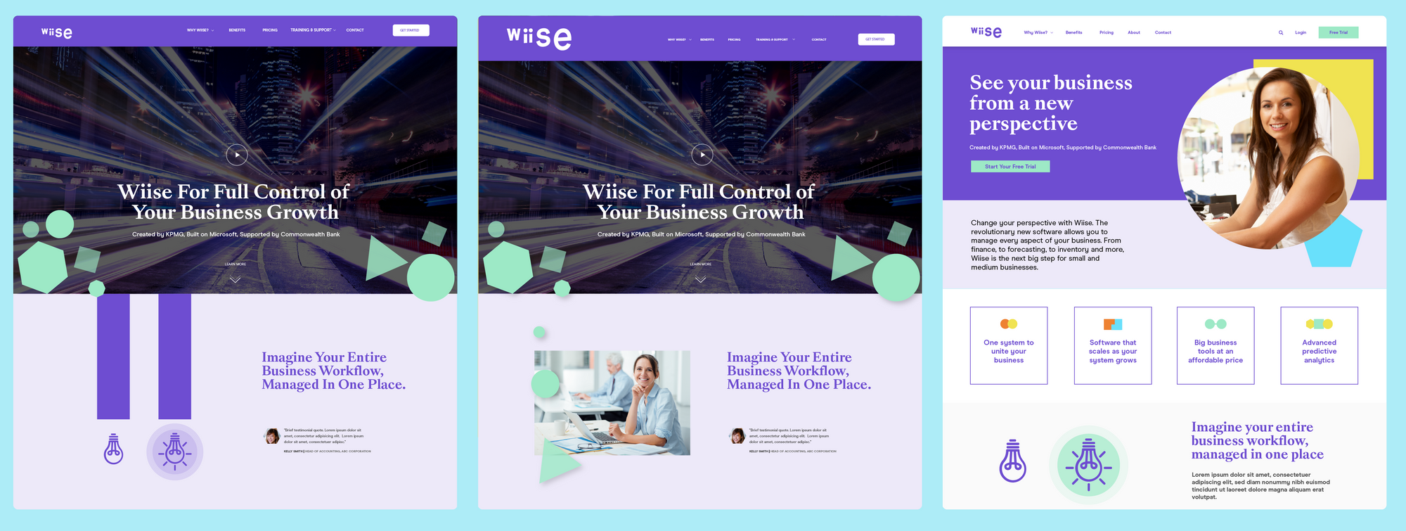
I wanted to really utilise the Wiise branding to the max by making the visual design really fun and colouful.
The Wiise brand guidelines provided to us by the creative agency consisted of colourful shapes and fun illustrations. Through this, I was aiming to create a delightful user experience, while also giving Wiise a market niche in space overflowing with otherwise very formal market messaging.
The home page required the most iterations in design. It would be the first major interaction new users would have with Wiise, so it was important to get the design right.
I also wrote the UX copy for each of the pages, and started the collaboration with Whitehat Agency's inhouse content team at this point. UX copy provides a guideline for the type of content that needs to go on each page and section. It also hints at the tone of voice, so that the experience flows from design to he copy.
As soon as each page mockup was finalised, I passed the design to the content team, along with a document containing placeholder text and character counts. This allowed the content team to start working on the content quicker, rather than waiting for the website to be built on staging.
Developer handover and UX quality checks
After finalisation of all designs, I worked closely with our development team during implementation. I wrote a UX document for the development team, with instructions on interactions and transitions.
I reviewed final website built for quality, to ensure that the envisioned user experience is implemented to the highest standards throughout.
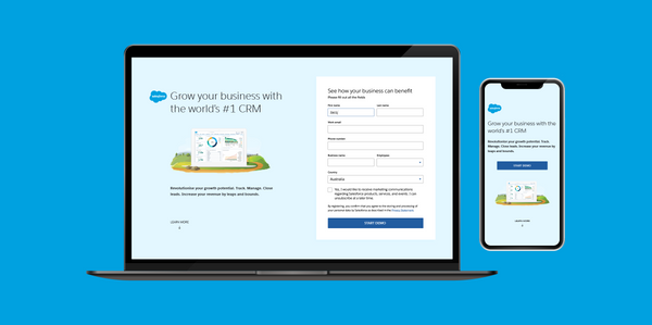
Wiise landing page for Microsoft
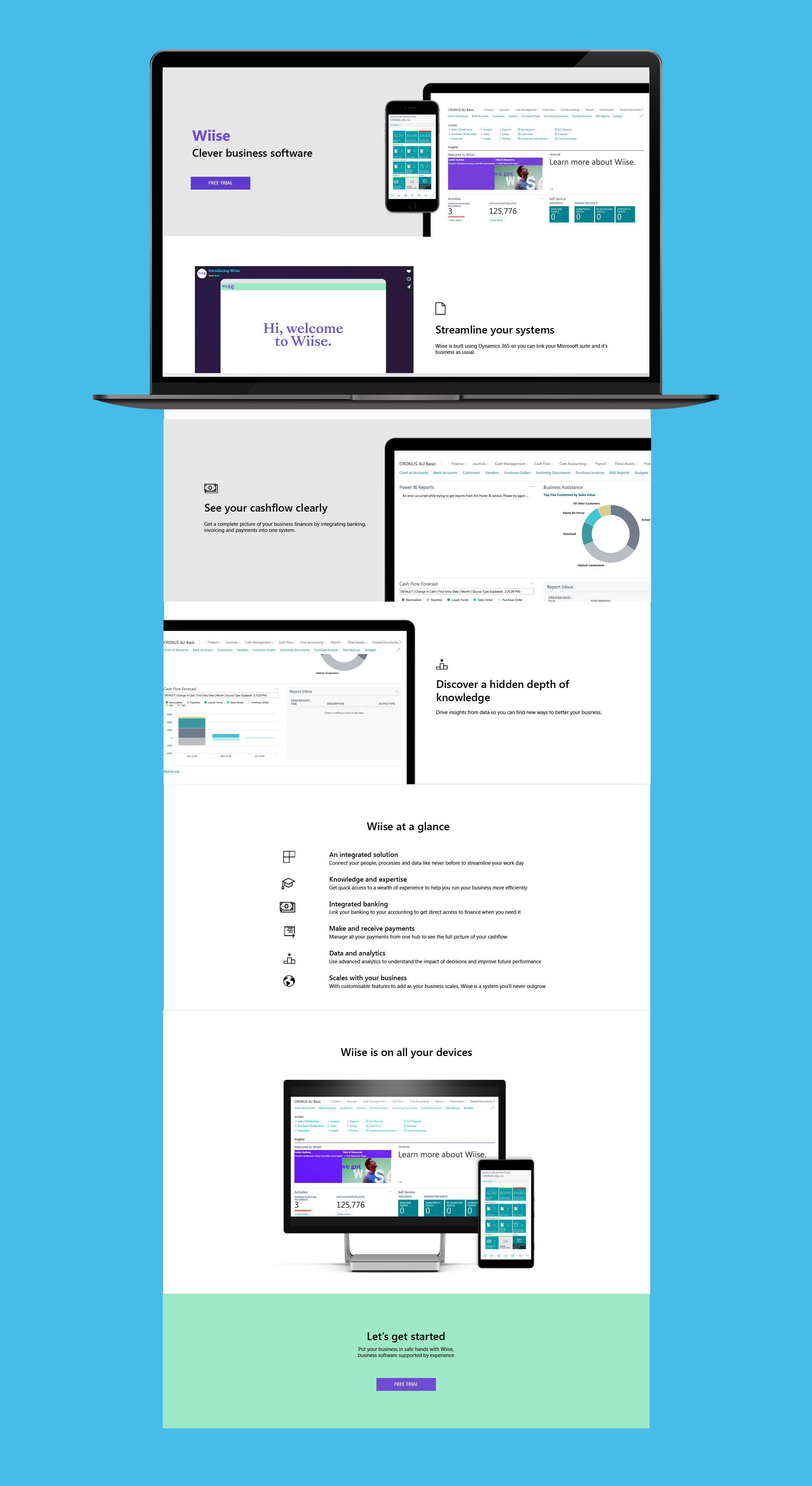
While the Wiise website was being developed, I also designed a landing page for the Microsoft AU website.
This landing page was designed as part of the Wiise launch. When Wiise went live, this landing page also went live for cross-promotion of Wiise.
This page had to meet the style guidelines of Microsoft, while also bringing in some of the fun colours of the Wiise branding. The end result was a good balance between the two.
Results / Outcomes
- Wiise launched successfully with a marketing website focused on conversions from the get-go.
- KPMG was able to utilise the website to build targeted landing pages and other marketing content.
- The website aligned with Wiise's fun and colourful brand.
- The website design aligned with brand guidelines and messaging matrices.
Reflections & lessons learned
- The market research KPMG had conducted was incredibly helpful in the design process. It provided a wealth of information on users and their pain points.
- Presenting iterations of design to a room full of people can be a bit nerve-wracking, but it allows for some of the best design feedback when people bounce ideas off each other.
- Interactive prototypes can help demonstrate user flow a lot more effectively than static files with arrows drawn all over them. For this project I utilised Invision, which made it easy to track comments and change requests.
- Designing website user journeys to segment customers into relevant sections is challenging. Some of it can feel like guesswork without background research or user testing.
- It would have been interesting to run optimisation tests on some of the content-heavy pages. I would have liked to see data on optimum page length and content layout. Conversion rate optimisation was not part of the project, hence it was not possible to do this.