Salesforce: Increasing conversion rates for key landing pages
UX research & landing page design to shift falling conversion rates to a +10% jump in conversions.

Client: Salesforce ANZ
Agency: Whitehat Agency
My role: Lead UX Designer
Project summary
Salesforce had engaged Whitehat Agency for search engine marketing (SEM) campaigns and optimisation.
Whitehat was identifying and implementing a few project-based tasks for Salesforce's SEM. This included writing optimised ad copy, keyword research, and landing page creation to ensure that Salesforce is getting the most out of their Google Ads accounts.
My role was to liaison between Whitehat's and Salesforce's marketing teams to redesign and write content for the following landing pages that were being used in Google Ads campaigns:
- Salesforce Brand / 'Generic' CRM
- Sales Cloud
- Service Cloud
- Marketing Cloud
Salesforce ANZ marketing team briefed us that these pages were not achieving conversions. Instead, the conversion rates of were steadily falling, causing ad spending to be wasted and users to not be engaged.
What I did
- UX research analysis: Salesforce had a wealth of marketing and UX research on their landing pages and website as a whole. I went through all of this research as well as conducting my own research to understand the main problems users were having.
- Conversion optimisation: I researched studies on best practices for increasing conversion rates through UX design, and implemented these where appropriate.
- UX design: I redesigned UI form elements with usability and conversions in mind. I designed on-page user journeys to engage users, build trust, and guide them towards a conversion. I also created final high-fidelity mockups of all 4 landing pages.
- Content: I wrote all the content of the 4 landing pages, keeping in mind optimum user journeys, SEM keywords, and Salesforce's copywriting guidelines.
Identifying why conversion rates were falling
The UX and marketing teams at Salesforce provided a wealth of user testing and interview data to me.
This was research done to find out where users were dropping off on langing pages, and for what reason.
All this data provided the following main insights:
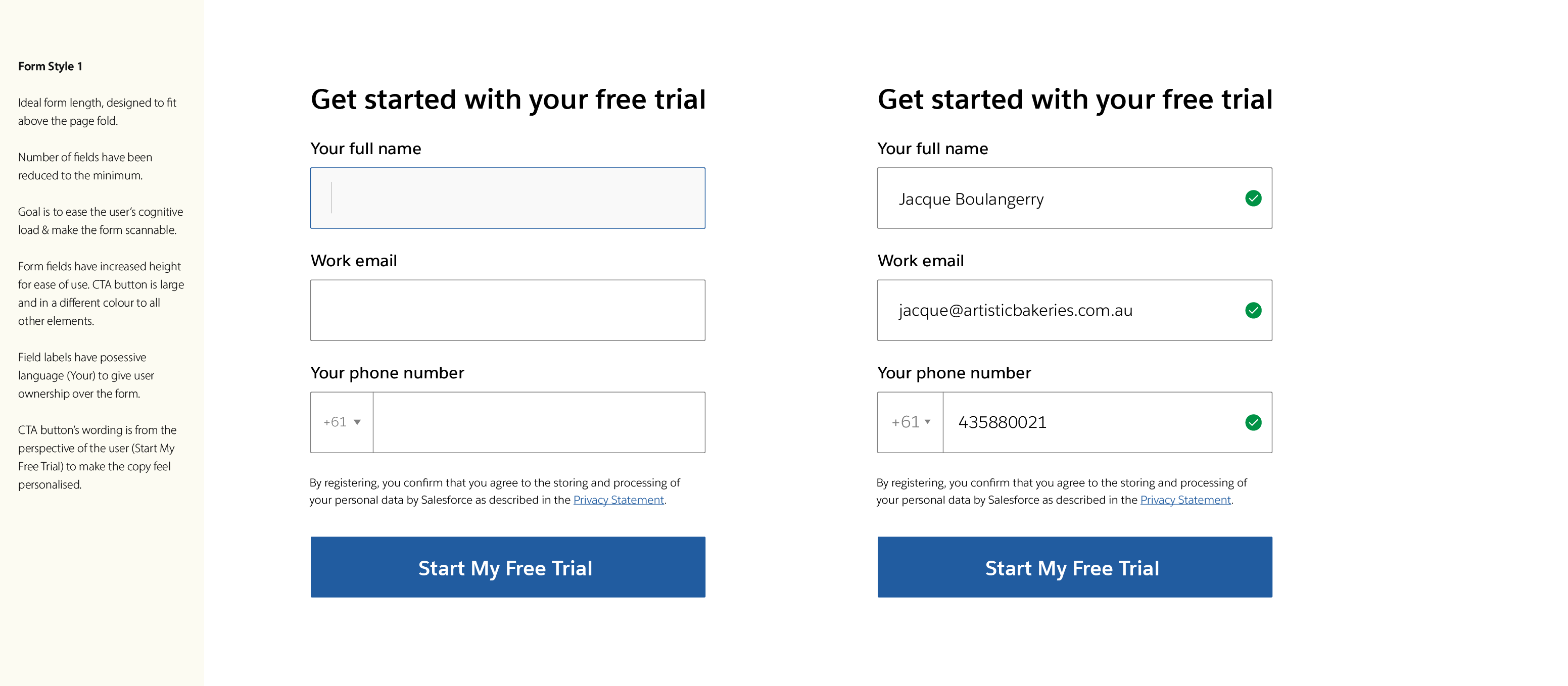
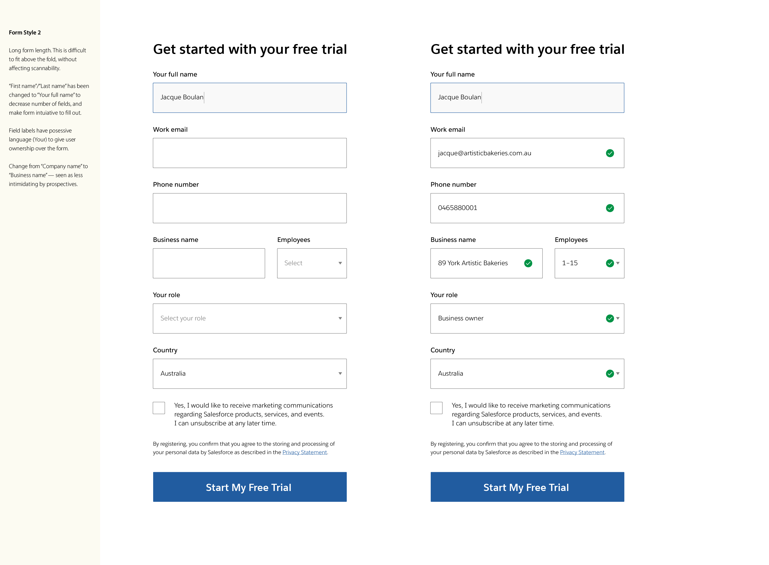
Optimised number of form fields
Salesforce ran a number of tests to measure conversaio rates according to number of form fields. Forms with 6 form fields performed the best compared to their variations.
Optimum layout of form fields
The conversion tests showed that layout of form fields stacked one on top of the other performed better than forms which had 2 fields per line.
Ungated content on the page
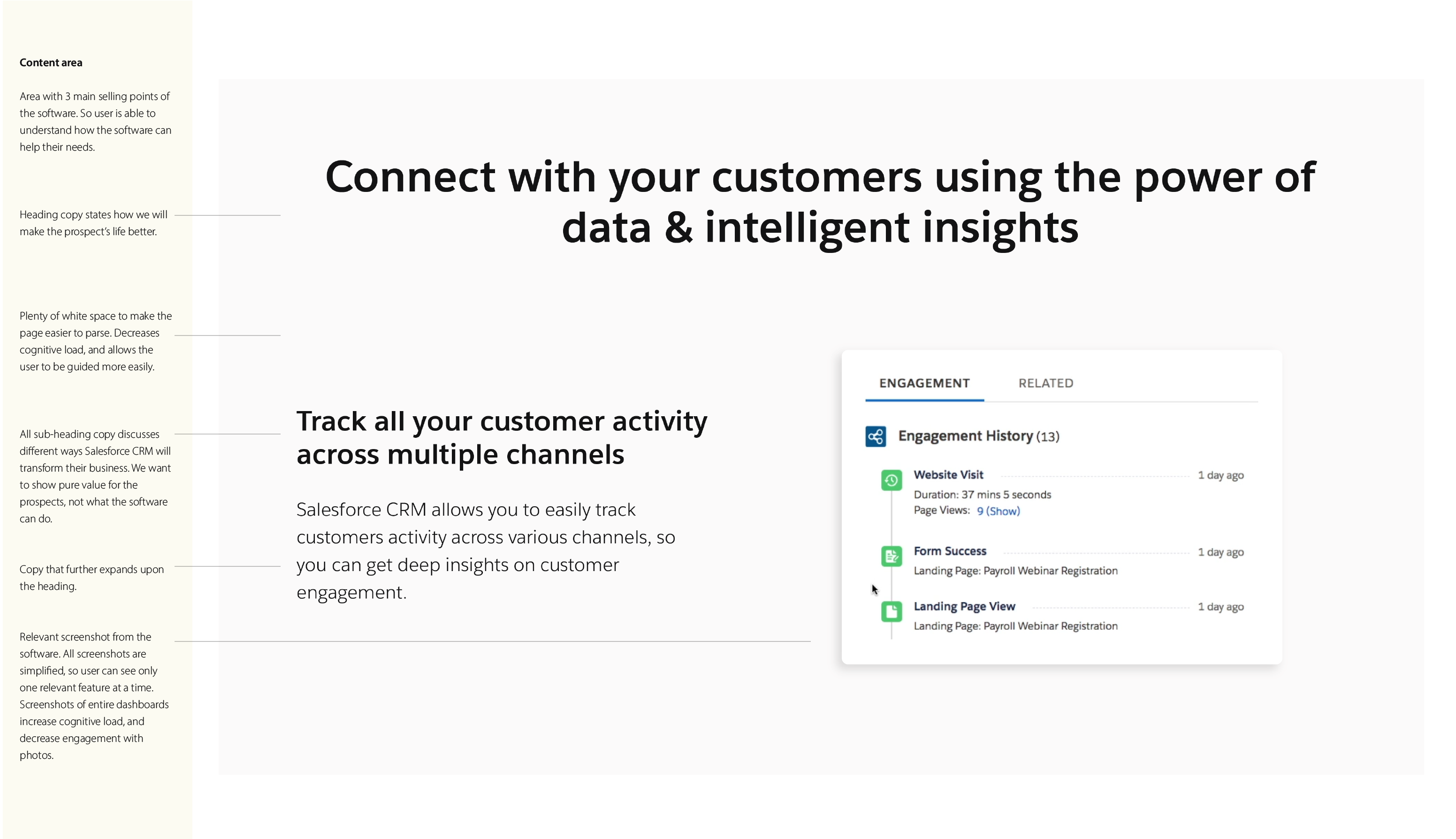
Conversion tests and user interviews showed that hiding content such as demo videos behind the sign-up form caused users to drop off. Users would close the Salesforce window and open up YouTube to find the same demo videos.
Putting content such as information and demo videos right there on the page kept users more engaged and interested in filling out the form to sign-up. It allowed them to make a "purchasing" decision, so to speak.
Content users are looking for
When users are not ready to convert, they are looking for extra content to read before deciding.
This content is:
- Direct business benefits to the user from using Salesforce.
- The direct impact Salesforce can have on the user's business (statistics help a lot).
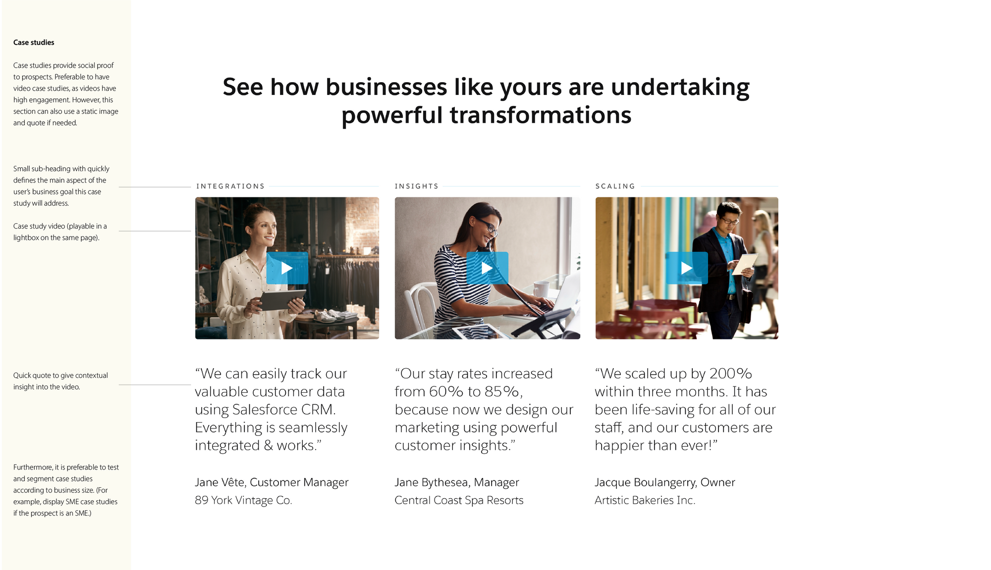
- Customer stories from similar businesses using Salesforce to align with business goals.
- Straightforward pricing information for small businesses.
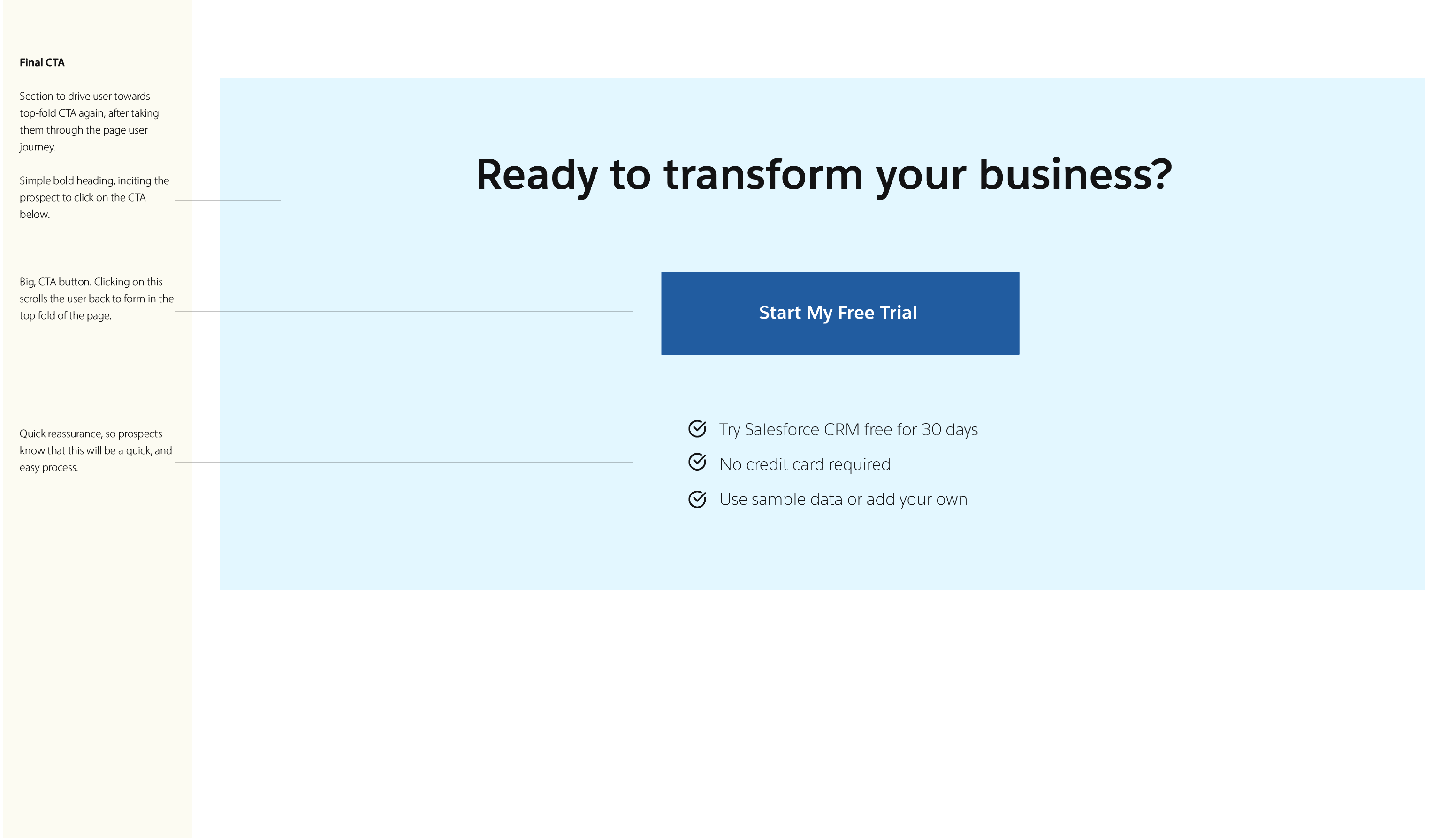
Call-to-actions that are enticing
Basic content such as demos and information were not enticing enough for users to complete a conversion. A call-to-action providing a free trial was found to be a much better value proposition, and increased conversions.
Landing page layouts
Users scanned content quickly for essential information. Large blocks of text and scrolling caused them to lose interest and drop off. They prefer pages that are easy to scan and traverse quickly.
“What would a high converting, highly relevant page look like?”
— Salesforce ANZ marketing team lead
Designing landing pages for conversions
I followed up the research synthesis with going through all of Salesforce's design and content guidelines, including their UI libraries.
Salesforce maintained landing page templates to utilise. However I insisted to venture outside of these template parameters to have a better impact on performance.
This was especially true of the form field elements, as their current design was less than optimum.
I wanted to redesign the form fields using Salesforce's own research insights, as well as following best practices defined conversion optimisation practitioners:
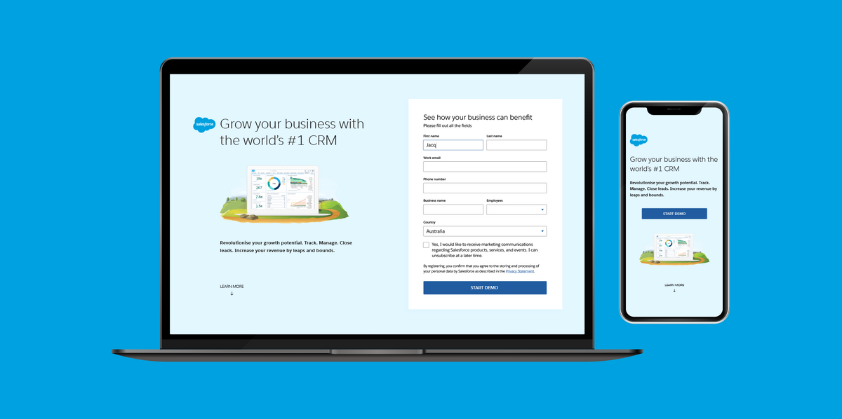
Salesforce brand / 'generic' CRM page
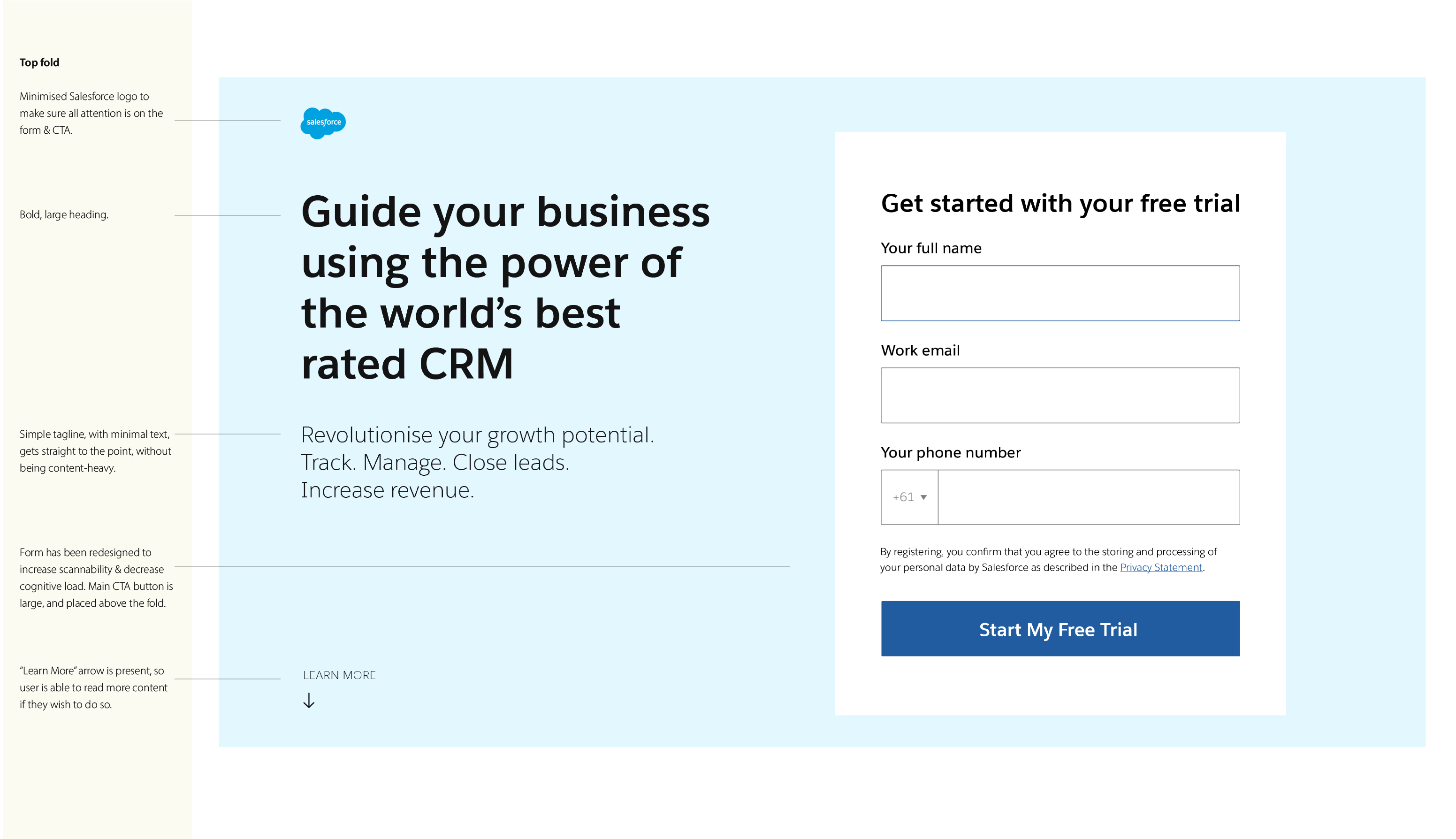
I designed this page first, and got final approval on its design before moving on to the other landing pages, as this page's design formed the standard template for the other landing pages.
I deemed low-fidelity wireframes an unnecessary step, as they would not demonstrate the design changes as clearly. Hence I straightaway designed a high-fidelity mockup, with lots of annotations on the design decisions and why they were made.
One of the main things to get right was the call-to-action (CTA) form, that would appear in the top fold (banner area). I redesigned the form UI using best practices and form optimisation research. I presented two potential versions of the form:
I redesigned the on-page user journey, to include lots of trust-building content throughout, including features and case studies relevant to small businesses.
I also made the typography more legible by using the heavier version of the Salesforce font.
We held design feedback sessions with myself, Whitehat's marketing team, and Salesforce's UX and marketing teams.
Overall, all involved parties were happy with the new direction of the landing page, especially the on-page user journey and conent provided to them to make a buy-in decision.
The form design was the main aspect that needed to be redesigned, as my form fields were taking up too much space, lengthwise. They needed to be a lot more compact.
As for the total number of form fields, the client preferred the longer forms. This was due to requirements of their internal sales team/process, as a certain amount of data is required to enter a new lead into Salesforce's own CRM.
I did two more revisions of the design, each time collating feedback before the final version.
I also wrote all the copy for the final version. I added 3 Salesforce video case studies that were about a small business + the service in question. This included a customer quote from the video the really help build trust.
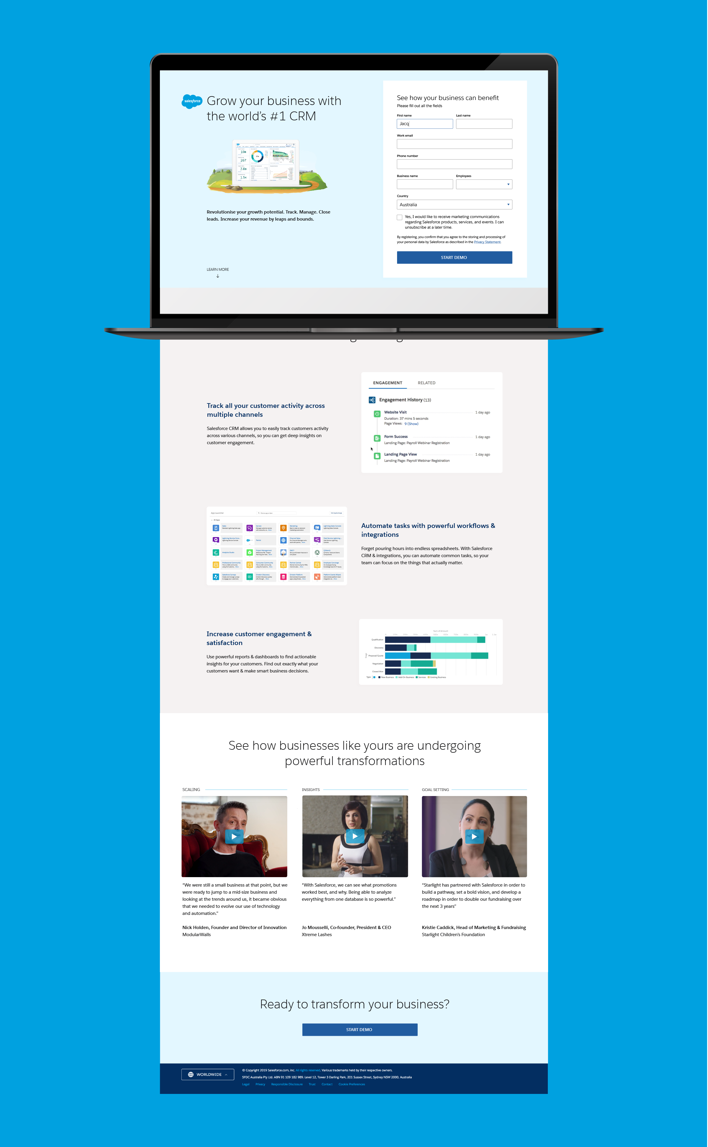
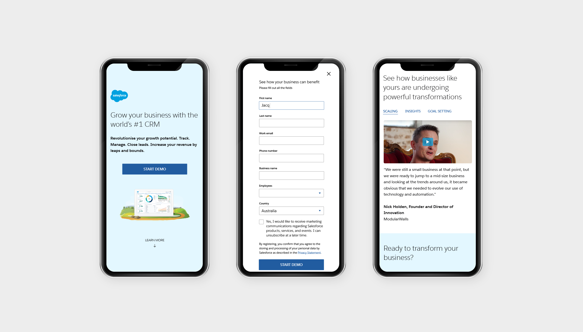
The final design included a mobile-optimised version, to ensure that the CTA form appears somewhere in the top fold of standard smartphone screens.
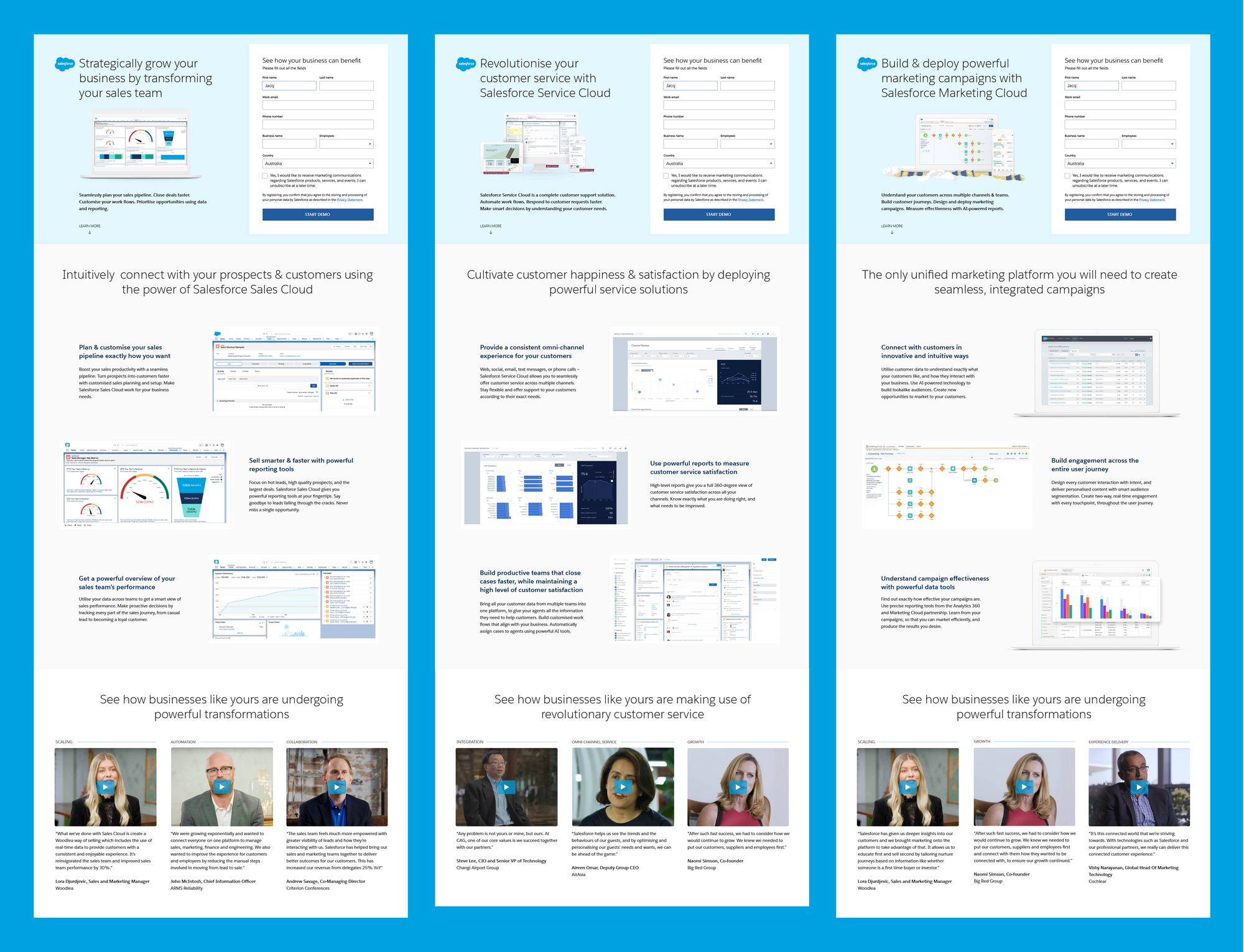
Sales Cloud, Service Cloud, and Marketing Cloud landing pages
Once the CRM landing page was completely finalised, the remaining 3 landing pages were very sraightforward.
I utilised the same template for all 3 pages for consistency, and wrote the copy + added in images and case study content.
Results / Outcomes
- I handed over all finalised content and designs to the Salesforce development team for development and launch.
- New landing pages were launched for the marketing campaign, with conversion-based user journeys and trust-building content.
- The Google Ads campaign Whitehat Agency was working on now had landing pages that aligned closely with the ad copy.
Reflections & lessons learned
- Ideally I would have liked to run optimisation experiments on all these redesigned landing pages. This would have allowed me to measure exactly how effective the new pages were in increasing conversions, as well as track changes over time. However, this was beyond the scope of the project.
- Seemingly simple design decisions like the design of form fields can make a huge difference in conversion rates and user engagement.
- Usability is key — if elements like form fields are not designed with usability in mind, no amount of adding enticing content can increase the conversion rate. If people can't fill out a form, they cannot convert from the call-to-action.